Why do they think we want a big, dramatic image as a background to our search page?
The logo is a good inasmuch as it departs from typical Microsoft logos, BUT it's still ugly.
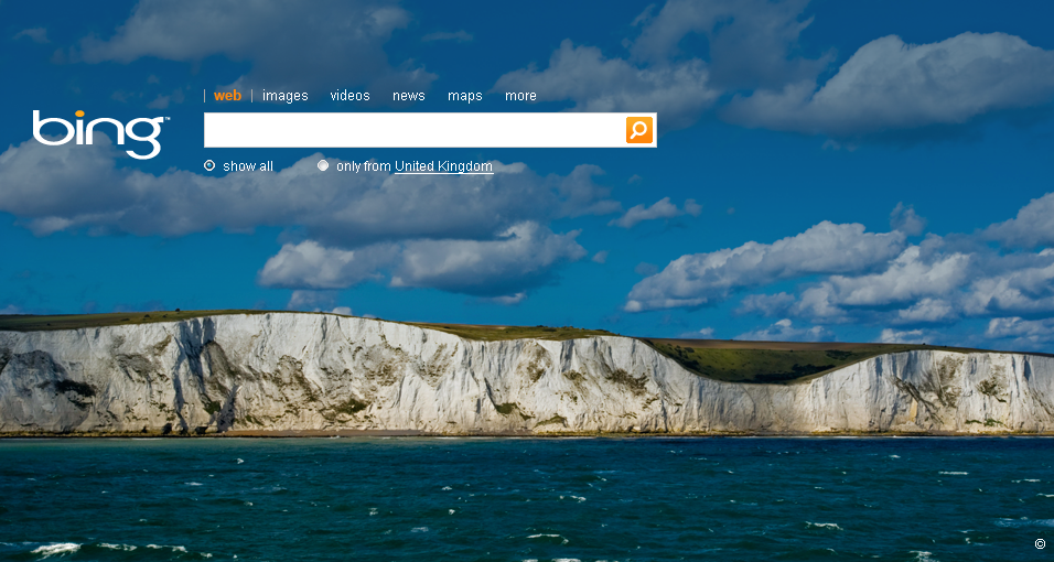
Especially since it's not live, all we have are these 1st impressions. And frankly the design choices are lame. Will this have an impact on it's success?
The logo is a good inasmuch as it departs from typical Microsoft logos, BUT it's still ugly.
Especially since it's not live, all we have are these 1st impressions. And frankly the design choices are lame. Will this have an impact on it's success?