I think it might be useful to put some screenshots of other fonts on your page, to show what symbol or alignment problems yours corrects. Because I've studied a lot of typeface design, and I can't really figure out what you're doing, what pain points you're trying to address.
Because when you say "and $, @, % seem ever mismatched?", I don't have the slightest idea what you're talking about. I certainly am curious though, since you went to all the work of building a new typeface!
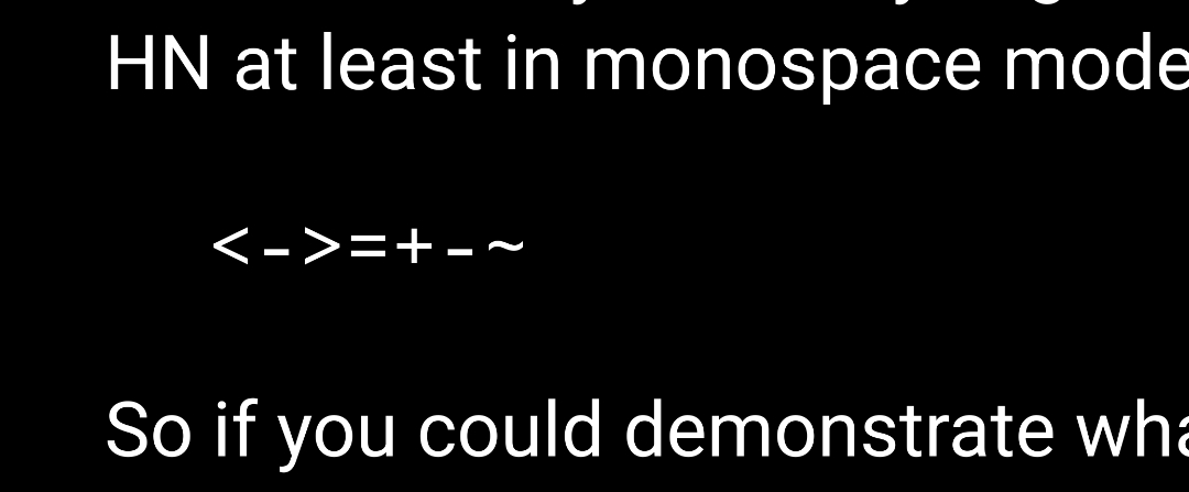
And when you talk about fixing alignment, like all of these seem correctly vertically aligned with each other here on HN at least in monospace mode:
<->=+-~
So if you could demonstrate what it is fixing with reference to the most common monospace system/coding fonts, I think that would help a ton.
thanks for the suggestion. i'd think about adding screenshots of other fonts.
about the alignment, i think the README might give an impression that it's solely about vertical alignment, but it's more about uniform flow of characters along with some resemblance with an actual symbol (which we can not have in ASCII).
for example, take the `<-` combination. i think you're correctly pointing out that in most fonts they are indeed vertical-aligned properly. but there are other details (horizontal alignment, angle between strokes, weights, etc) which i found missing. in most monospace fonts, these less-than and more-than signs are not designed with the view that their most common usage is indeed not checking for inequality but for bitwise operators and struct pointer dereferencing (C), function declaration and monadic/applicative/functorial programming (Haskell), shell redirection (bash), function composition (OCaml, Elixir), tags (HTML), and countless others. if you think about it that way, it makes sense to not make the angle between strokes too small. many monospace fonts do it because they respect classical typographic conventions regarding space and design. the same goes for the designs for backquote, tilde, comma, colon. in most monospace fonts, backquote is so small it's barely visible and tilde looks too much like the hyphen, etc.
Myna is my attempt to break some of these conventions to make things look a little bit even for programmers.
Because when you say "and $, @, % seem ever mismatched?", I don't have the slightest idea what you're talking about. I certainly am curious though, since you went to all the work of building a new typeface!
And when you talk about fixing alignment, like all of these seem correctly vertically aligned with each other here on HN at least in monospace mode:
So if you could demonstrate what it is fixing with reference to the most common monospace system/coding fonts, I think that would help a ton.