What am I missing here? In iOS 5, it's black on blue vs black on green. Now it's white on blue vs white on green. Contrast between text and background looks the same to whether green or blue.
In general, Apple has lowered contrast throughout the UI over the years. There's an accessibility setting for high contrast if you need it.
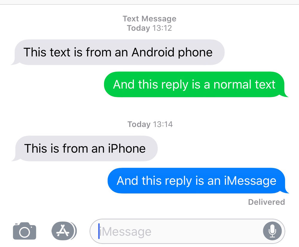
Green has higher luminance than blue at equivalent saturation. The values for SMS and iMessage background colors are, respectively and in sRGB, #00CC46 and #0080FF, corresponding to relative luminance values of 0.436 and 0.227 according to the WCAG 2 formula.
With white foreground text, this gives a contrast ratio of 2.15:1 for SMS and 3.79:1 for iMessage. WCAG 2.x AA level compliances requires a contrast ratio of at least 4.5:1 for normal text and at least 3:1 for large text.
Thanks! If you have a calculations workflow already, what would the contrast ratios (even if approximate) be for old iOS? To a human eye it truly looks like SMS got way worse whereas iMessage stayed around the same.
The pre-iOS 7 graphics have black text over a non-uniform background color as compared to white text over a uniform background color. This gives us ranges instead of a single value, but even in the worst case, black is a vastly more legible foreground color:
To my eyes, the green/blue doesn't make much difference in terms of legibility. I obviously find the reduced contrast throughout iOS annoying and keep increase contrast turned on.
It's worth pointing out that Apple has some of the best accessibility options out there. There's an "Increase Contrast" setting that increases the contrast for SMS messages.
Yes, one could argue that the default should provide high contrast for everyone, but once this setting is enabled, it effectively becomes just that going forward for those that need it.
Apple products seem to require more and more tweaking of the right settings to be usable. I'm dreading the day I have to get a replacement MacBook and have to tweak all my settings again.
I also Have no trouble reading text messages from Android in IOS. not sure what people are talking about. I still think its wrong to distinguish between the two platforms as it points to anti-competitive behavior. Apple does other things that are way worse.