Surprised that nobody has noticed that the “a” - with a tiny riser - is used in Roman version of many typefaces and the other “a” is used in the italic version of the font. See this article for more information on that https://creativepro.com/dont-commit-the-type-crime-of-applyi... I see this mistake being made all over the place which as a former graphic designer makes me sad.
A big benefit of using LaTeX for writing is that it enforces typography rules like this out of the box, without having to study typography beforehand. I hadn't really really why italics just look so much better in LaTeX than Word, so thanks for sharing.
> True, for many typefaces, Word will automatically apply the proper italic fonts (if you have them installed)
That was good to know. Relieved me of angst for the guilt I was going to feel knowing I would never be the guy changing the font for one italicized word. :)
I followed a reference in that article to the article on Letter Case [0] which just blew my mind:
> The terms upper case and lower case […] originated from the common layouts of the shallow drawers called type cases used to hold the movable type for letterpress printing. Traditionally, the capital letters were stored in a separate shallow tray or "case" that was located above the case that held the small letters.
I can’t believe I’d never considered the origin of “case” in uppercase and lowercase might be an actual physical “case”.
It's similar to being "out of sorts", which today (and maybe even historically) means you're not feeling well. It came from letterpress where the case of type is collectively called a "sort" and if you were trying to put together a print run and you ran out of, say, the letter 'r', you are now "out of sorts".
> During typesetting, individual sorts are picked from a type case with the right hand, and set into a composing stick held in the left hand from left to right, and as viewed by the setter upside down. As seen in the photo of the composing stick, a lower case 'q' looks like a 'd', a lower case 'b' looks like a 'p', a lower case 'p' looks like a 'b' and a lower case 'd' looks like a 'q'. This is reputed to be the origin of the expression "mind your p's and q's". It might just as easily have been "mind your b's and d's".
How so? It's a question in English about the English language on a primarily English website, so I would expect it to be about English, but I don't see how it is US-centric.
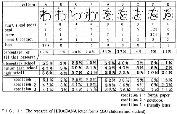
An interesting example of this is that handwritten hiragana (one of Japan's two non-ideographic character sets) has many variations for some characters, some of which are regional and obscure enough that people won't recognize them. In some cases the variants look like other characters, which can make it very difficult to decipher handwritten text.
In this example: http://www.shosha.kokugo.juen.ac.jp/oshiki/ronbun/currentofr... some of the less common variants (but common enough that I've encountered them) of 'wa わ' look similar to 'yu ゆ', so as a foreigner I found this very challenging and mysterious until I did the research. In comparison the various forms of English characters don't feel so bad anymore :-) If you're familiar with hiragana you'll also notice that a variant of 'を' looks quite similar to 'さ'.
Hiragana also used to include characters that are no longer used in most contexts (you'll still see them in names), like the historical 'wi ゐ' (you can't even input this with some IMEs or look it up by name in en/jp dictionaries). A historian would probably be aware of some western equivalents of this - the only one I'm familiar with is 'et &' (as in 'etc'), which you'll see in old documents as '&c'.
Oh, and how could I forget: if you ask for the USD/JPY exchange rate, Google will call it "Japanese Yen", which is written 'en 円'... because the 'ye' character is no longer a part of hiragana. (I don't actually know whether it's still commonly pronounced as 'yen'. I wouldn't be surprised...)
It's not pronounced as 'yen' anymore, but it was in the past. Some of the historical kana that are not commonly used anymore, such as ゐ、ゑ used to express sounds that are not distinguished anymore, but were retained in historical orthography for a while.
It seems ゑ 'we' was pronounced 'ye' in the past (It seems え also was, at least in the middle ages, hence old forms such as Yedo for Edo 江戸)
Nowadays, ゐ is pronounced 'i' and ゑ as 'e', so words that were written with them now just use い and え instead.
ゐ、ゑ became most relegated to bring an 'antiquated' look. Think Yebisu (ヱビス) beer, written with ヱ, the katakana equivalent of ゑ, that also kept the archaism in the romanization, as Yen did. So ヱビス or ゑびす are read as 'Ebisu' even if written with the archaic kana
But some Ainu and Okinawan orthographies have adopted their used (in case of Ainu only the katakana variants, I believe)
を 'wo' (but really pronounced 'o') nowadays is only used as the 'direct object particle', but it was used in words like をとこ (男 man). As it ceased to sound different from お, subsequent orthographic reforms also removed it from use except in the particle function.
Oh, that anecdote about 男 is fascinating. I never would have guessed. Thanks for the insight :) The various ways to pronounce the characters (particles, in particular) definitely adds another layer of depth here.
It explains the shifts in pronunciantion in Japanese, making old Japanaese kana ortography differ from actual pronunciations, as in English orthography today. The remains of the old system can still be seen in the particles:
A particular shift is medial and final h/f->w and w->∅(except) for 'wa'. This meant that non initial は was pronounced 'wa'. For example, かわ 'kawa' (river) was written as かは before the reform. The かは reflected and even older pronounciation of 'kapa' for the word
There's a shift p->f->h on the は 'row' explaining why ふ is 'fu', and why ば is 'ba', as 'b' is the voiced equivalento of 'p' and not 'h')
There was the same thing for へ, かえる 'kaeru' (frog) was written かへる historically, reflecting these changes. From wiktionary:
So the particles は and へ, being pronounced 'wa' and 'e' instead of the expected 'ha' and 'he' are just remainers of this old orthography conventions, and give hints that the old form where probably pronounced 'pa' and 'pe' over a thousand years ago!
I've always written "a", just because I think the other style is ugly. I have a Christmas stocking which I insisted, long ago, on having embroidered with the same style of "a".
I tried once to write "g" with loop below as commonly printed, but I couldn't make it look decent.
It's admittedly a bad habit of mine, but I write lowercase "g" like a numeral "8", only translated downward a little. It has two loops, and gets the point across (when I know it's only myself who will read my scrawl.)
As a kid, I was influenced by the font used in the Neverhood to adopt this style. :) At some point I even wrote lower case 'a's like in print. That didn't stick, but the 'g's did for whatever reason.
I find the author’s answer quite satisfying: sometimes human beings make choices for reasons they cannot remember, will never reveal, or for no reason at all.