This happens a lot. You get some smaller image, or just the same one all stretched and blurry.
I can understand it for some small-time operators who don't have the resources or technical know-how. But for big-brand retailers etc they have zero excuses for only having one tiny 300x200 jpeg of something they are trying to sell!
Please give me some proper high-quality photos (that are over 1500px on a side and not jpeg'd to death) of the stuff you are trying to sell, ideally from multiple angles.
> Came to describe the solution but you were quicker.
A skill honed by years of chasing those reputation points on Stack Overflow!
Edit: perhaps I should explain. SO is known for people trying to grab points by being the quickest to answer a question. If you're there first, you may get upvotes, and it can snowball from there.
Of course we all want to provide useful help and advice, not just chase points.
But those points are delicious. I even have them on my resume!
So a common trick is to quickly answer a question with the bare minimum that could possibly be helpful, so you're among the first to be noticed. Then start editing and revising the answer to improve it and make it really useful.
It is a strange strategy, but if you do it right, it's a win-win: you get the points and the satisfaction of helping not only the original asker, but hopefully anyone else in a similar situation.
I've settled on DoubleCmd [1] for over 3 years now. Open source and cross platform and even snapshot builds [2] are pretty stable. Double click to navigate to parent folder, etc. Highly recommend for power users.
+1. In my opinion Double Commander has the best multi-file renaming capabilities too.
(Don't let the beta status put you off. The releases, as mentioned above, are very stable.)
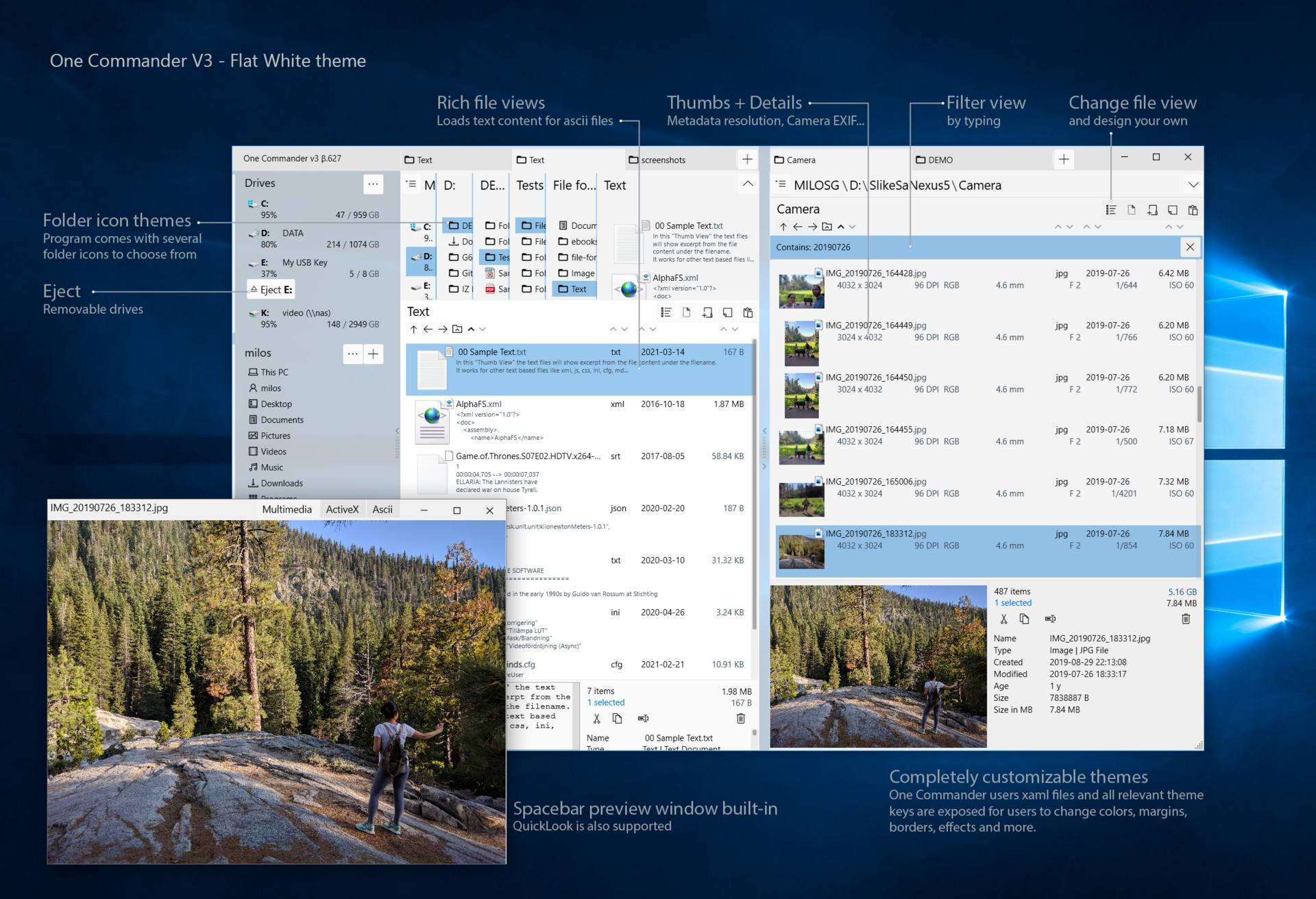
i wish their site has at least one screenshot of what the app looks like. It's hard for anyone to evaluate whether they should switch over without even looking at an image first!
Double commander is IMO better then TC (apart from still being buggy). It has better interface for included tools like multi rename and is cross-platform. Since all TC plugins work in it, there is no need to use TC.
I created bunch of chocolatey packages that can be used with both and 2 skins that make them look the same:
So, one of those two commands will make you have almost exactly the same experience with 20 or so really useful plugins all installed within minute unattended and with all components updated with single command (the TC one being commercial):
    cinst doublecmd tcp
    cinst totalcommander tcp

    cup all # update TC/DC or any plugin/config any time
There is a micro framework included so anybody can make their own configurations in minutes or publish any type of plugin:
Yes, it is even mentioned on the web site and it also supports Total Commander plugins (IIRC Ghisler mentioned at some point that he's fine with other file managers adding support for TC plugins since it means there will be more plugins available).
Sadly it feature-wise it is very behind Total Commander, i use TC all day all the time and DC always feels like an unfinished alpha version of TC. It kinda reminds me of Midnight Commander vs FAR Manager with the latter being way more advanced than MC (though Windows only), but even then despite its lack of features MC still feels mature and is what i end up using on Linux despite preferring GUI applications.
Perhaps if i ever decide to switch to Linux as my main OS at some point i'll try to work on Double Commander myself and implement the stuff i'm missing. From what i can see it is written in Free Pascal and Lazarus which are my jam anyway :-P (FWIW the 64bit version of Total Commander is also now compiled using Lazarus so i hope at some point Ghisler releases a Linux version...).
I used WPF a few times when it just came out. Really enjoyed it (definitely compared to what was available at the time). I think a lot of people felt the same way but then Microsoft really killed it by being ambiguous on its future and not giving it any love or attention. Microsoft was betting on their new Universal/Moderm/Metro UI with JS-or-something but AFAIK that never really became a mature technology that could be used for anything other than simple “fart button” style apps. Only recently have they realised what a great technology they have floundered and started giving it some love again, unfortunately only after most fans had already left the party.
Ran it from the portable version. Looks really good. It's time Windows Explorer gets some fresh blood!
I know it's not going to be possible for the default Windows Explorer to change, because it affects too many people. However, this kind of development which shows different capabilities that are possible with new thinking. An example being the colour coded ages of the directories. That's a really cool idea, compared to sorting by the 'Modified By' column.
Most other alternatives end up doing a two-pane view with minor changes, which I've never found sufficient to want to change.
From the Trello todo list, I see Keyboard Shortcuts are also on the anvil. Great.
Best landing page I've seen in a while. Software is slick as hell. I used to use the old Midnight/Norton Commander software under DOS in the 1980s but have hated most modern implementations. To my surprise, I love this one - super polished, super responsive, fully intuitive and with a very consistent UI. Beautifully customizable theming too.
I curate a large and disparate data collection that's rather a pain to manage and this seems lie it will substantially reduce the daily grind, so after only a few minutes of use it's already pinned to the taskbar.
Disagree 110%. No pinch to zoom, screenshots too small to see anything, no copy text as to what features it offers, embedded twitter which means it's probably loaded with javascript trackers.
It looks really nice, and I also like the column navigation. But what I’d be missing is dual tree nevigation which is something I use a lot. My explorer of choice is Directory Opus [0] (though it’s costs quite a bit more) which I have been using for almost 10 years now. Besides dual-trees, it also supports soft-locked tabs, something I never would have asked for but couldn’t live without now. SFTP is a nice bonus.
All these commanders are just shit. Instead of making things simpler they make them more complicated by overloading UI to the limit. That's why I still use the default file manager.
What I need from any file browser is usable, helpful search - not the crippled, maybe-we'll-find-it-in-an-hour - that was part of explorer from Vista forward.
The issue with expanding the screenshots on mobile needs to be addressed
I think there is room to charge more.
I would price it as annual subscription at $29-$59 per PC. The current price of $5 makes it look cheap and toy software. Sign executables and install ssl certificate on the website - you are missing on a large number of early adopters if you skip it.
A high price tag will keep users away.
Why paying for something without knowing if it fits to your daily workflow?
Asking for money after some period of usage is the right way.
As someone who publishes a small software as a side-project, signing my bundles is a pain in the a*.
You not only need to shell out some 100$ to stupid companies like comodo who should not even exist, but also need to incorporate a company or do some crazy paper work to get it.
If any fellow small windows side project developer has a solution I’ll be happy to hear.
Yeah this put me off from trying it out and maybe using it long term.
It's interesting at how jaded you can become from a first impression. The lack of SSL on the website made me think the author doesn't care about the project or maybe there's security vulnerabilities in their application. Or even worse maybe there's hidden telemetry in the closed source app that will send back lists of files or even file contents back to their server insecurely. I didn't want to have to spend all day analyzing Wireshark while exploring all of the features of the application to see what it may or may not send over the network.
All of that from no SSL certificate and unsigned software. It looks good and I'd like to try it but these open questions in my mind are more dangerous than having a better file browser.
It's Windows software, Open Source is less common over there.
If you want OSS alternatives for Linux, here are some. A few may look old and unpolished, but today pretty much every desktop environment comes with its own file manager.
Back then it felt like half of users swore by Norton commander and had to organize files every day for some reason.
The other half just didn’t bother.
My observation is that one of these groups later used Winamp and managed their own music files in some elaborate structure and the other group found that iTunes kept a structure (not perfect, but with zero effort) and loved it.
(There are lots of overlaps here e.g I guess which group is now on iOS and which felt “I’m using Android because it’ll let me manage my own files”?)
My first reaction was "very busy design" which is not bad (think about Excel) but those overlapping folder names are puzzling. Maybe they are OK when one is familiar with a file system layout, which is the case for all of us on our own computer. Same thing for all the other panes. It could be one of those tools for power users that need a complex UI because they do complex things.
So I tried tapping on one. It did a cute animation and got smaller. And still no pinch zoom.
Then I got a clue. After tapping on the image, I long-pressed it and selected "Open image in new tab".
Bingo! Now I have the screenshot open and I can pinch-zoom it to see the details.
This is not a complaint, just a tip for anyone who has trouble with the screenshots on mobile.