Very few watchmakers, even at the top of the range, seem to get typography right when it comes to day/date/month windows. They just print whatever gets the information across and call it a day. At best, they might match the color and add a border around the window. It's almost as if they only care about designing the top layer of the dial.
The only well-known brand that consistently seems to get it right is A. Lange & Sohne, which totally makes sense because prominent numerical displays are one of the distinguishing features of their style.
Japanese brands are even worse. Take any complicated Citizen watch and you'll instantly recognize the "Eco-Drive" label in italic Arial/Helvetica with awkward kerning. Every element is printed in a random font that looks suspiciously similar to one of the Windows default fonts. The margins are all over the place, too. Seiko is somewhat better, but only because they usually don't print as many letters and numbers on the dial.
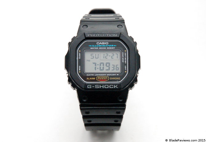
It's polarizing, but a lot of people (including me) absolutely love the "wall of unnecessary text" on some Casio models. I can't defend it on any logical level, but I'm certainly not alone.
    Take any complicated Citizen watch and you'll
    instantly recognize the "Eco-Drive" label in
    italic Arial/Helvetica with awkward kerning.
I agree, and I think it's just so baffling and frustrating.
Their use of solar (quartz) movements means that a lot of enthusiasts have no interest in them, but I think they make a lot of the best watches under $500USD. However that Eco-Drive logo is just so basic. A minor tweak to that Eco-Drive logo alone would do wonders for their brand, I think.
I wonder if the suits in charge of Citizen realize how bad/boring that logo is. I think they honestly may be blind to it, just as Western suits might be blind to typographical issues when they look at kanji characters.
At least Casio is consistent. Notice how all the text in your photos is set in the same typeface, despite the variation in size, color, and styling. You could call it "Casio Sans". It probably comes attached to a detailed style guide. It's so much better than the soup of random fonts that Citizen and Seiko tend to use.
> It's polarizing, but a lot of people (including me) absolutely love the "wall of unnecessary text" on some Casio models. I can't defend it on any logical level, but I'm certainly not alone.
For people who grew up wearing the famous low-cost Casio F-91W [1], I'm guessing it might have something to do with nostalgia.
I know I chuckled when I clicked on those image links and saw the abovementioned "wall of unnecessary text".
The only well-known brand that consistently seems to get it right is A. Lange & Sohne, which totally makes sense because prominent numerical displays are one of the distinguishing features of their style.
Japanese brands are even worse. Take any complicated Citizen watch and you'll instantly recognize the "Eco-Drive" label in italic Arial/Helvetica with awkward kerning. Every element is printed in a random font that looks suspiciously similar to one of the Windows default fonts. The margins are all over the place, too. Seiko is somewhat better, but only because they usually don't print as many letters and numbers on the dial.