- I often don't get notifications at all, on either platform.
- The Mac client crashes too often.
- The Mac client uses more resources than it should.
- Threads are useless.
- Settings are split into too many different views.
- I dislike the design. It's too spaced out (even with the "compact" setting). There's no dark mode. I don't like the icon. Everything is too cutesy.
- I hate the emoji. I don't want more emoji in my life.
Most of all, I hate the hivemind that says it's the only viable chat system, so much so that even open source projects use it over IRC. Hipchat wasn't too much better, but I've not gotten the chance to use it in the past few years because everyone defaults to Slack. I'd love to try Facebook's new work thing, but there's the same problem.
> so much so that even open source projects use it over IRC.
Remove the small amount of technical know how to "properly" use IRC and make chats (and permissions) persistent, and I imagine you'd end up with something that looks eerily like Slack.
That said, I think the Slack load-time in-browser is silly-long and I get spammed with notifications. As for threads, Zulip (https://github.com/zulip/zulip) does things "right" and I wish Slack would rip off their approach (central topic is the "room" and threads are independent, visually-separate-when-highlighted chats within a central topic).
I've used IRCCloud before, and I thought it worked well. They have an "internal" type plan as well with a private server, but as above I can't get anyone to try it because Slack owns the mindshare.
I really can't understand why Slack doesn't just go with a native app (to address performance issues on Electron).
They're a big enough company to work on developing platform-specific apps which would totally improve the user experience (from a performance standpoint at least).
Their new electron app is better in perf and memory and generally the experience is the best I've had (and I've used professionally pretty much every chat app there is).
Compared to alternatives like HipChat or Skype it's eons ahead.
But threads are useless indeed, I'll give you that.
At work, it's probably JIRA. Tons of UI noise, text markup isn't what I expect it to be and nobody around here can seem to agree on what features should be used for a particular scenario.
Past work, it would have been Identity Finder by a landslide. Awful UI, awful support, super intrusive, a total pain to administer, just bleh. Glad I was able to wash my hands of that.
Personal stuff, iTunes. I genuinely like the interface (at least on macOS) but it's huge and bloated and doesn't do some of the things I want it to. If they ripped out everything that wasn't related to listening to your personal (local) music library, I'd probably like it quite a bit. I wish it would write metadata to file tags rather than its own database, but I forgo that if it got rid of all the other crap.
JIRA definitely comes down to implementation and policy. I've used it in places and it has been amazingly helpful as a developer, to the point I don't know how we did anything before it.. Then going to a place that totally misuses it and causes me to triple-handle everything.
If your company is large and you're looking at JIRA, pay a consultant to come in, set it up for your different teams and train people. It's worth the money, otherwise you won't see the benefit JIRA brings.
JIRA. OMG. It's really awful. Its UI is cluttered and inconsistent. Search is slow. It's impossible to find things. Markup syntax is horrendous. It's easy to make mistakes and extremely difficult to fix them.
Re: iTunes, I would love a separate Apple Music app for desktop. 95% of the time I open iTunes on desktop it's just to play music. It's cluttered with so much stuff I rarely or never use.
Lately for me it's the iOS Music app. Every iOS release it gets further away from the original purpose. Off the top of my head, the "Search" screen used to show the last 10+ things I searched for (artists, playlists, songs, etc). Now it only shows the last 3 things I searched for, and fills the rest of the screen up with what's trending on the iTunes store. I didn't ask for that!
It also regularly refuses to play music which has been downloaded to my iPhone because my cell signal isn't strong enough. I have to put it in airplane mode when I'm on the subway.
I feel like they're trying to be like Spotify, but as every change they make to Music makes it worse, they're just driving me to use Spotify more. For example, the list of albums from an artist is almost unusable now. Everything looks pretty but usability is poor.
My first place award goes to SAP, which I have to use for time entry.
The procedure for entering vacation time is "Put in the hours and the code for PTO. Now hit enter. Yes, it'll all turn red and it'll display an error. Hit enter again. Everything else just autofilled."
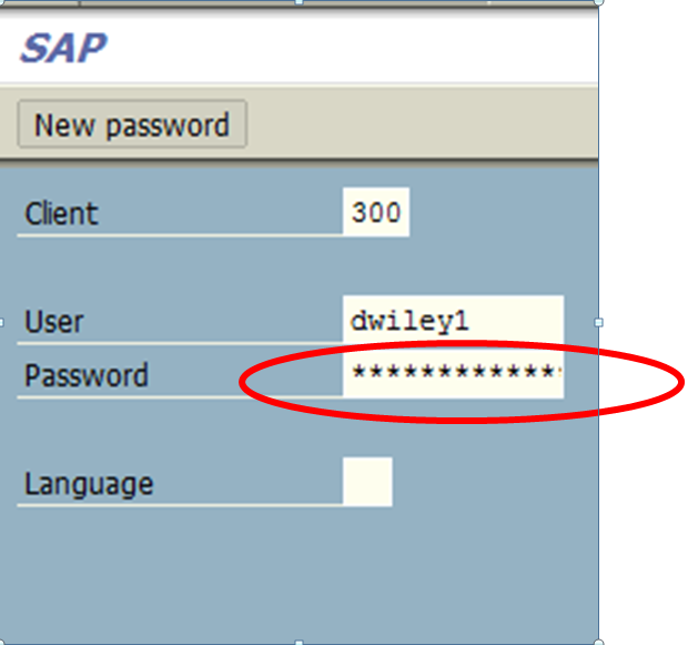
The procedure for changing an SAP password is to click New Password on the login screen[1]. No, not after logging in, if you accidentally did that you need to log out and try again. (Bonus: you can only tell it's a button after you hover over the innocuously placed text)
I'm not familiar with SAP at all so maybe this is just a failure of a specific implementation and the curse of customization, but it bothers me immensely.
Second place goes to the Jazz web interface for having page content reloads be distinct from page reloads. Oh you opened the work item again? It's still got the old version cached with the banner "The content of this page has changed, click here to refresh."
It's designed for an 14" CRT, showing only like 10 days of 31 days months - happy scrolling in both axes with non standard scrollbars.
You have to enter the hours per day in decimal minutes (1.00 = 60min, 0.25 = 15min) instead of the more human natural 60minutes.
The table UI control is completely non-standard. The Save button doesn't work like expected, it automatically closes the page, or a popup comes up there is nothing to be save - how dare you that you even thought about clicking on the button. If you open the page, all your data is locked, and no one else can access your data.
It's an 1980s nightmare program, that got reskinned in 1998 with "fancy" UI over ASCII char based UI elements.
I have to use the mySAP web-based version of CATS, which is at least as bad as the SAP GUI version, and even slower. Truly some of the worst software I've ever had the misfortune to use
I'll have to say with SAP, it's really down to how it's implemented. I've seen AWFUL implementations of it (like the one you're describing) and I've seen amazing ones, generally the ones either done by SAP themselves or by their recommended partners are the best.
Having said that, it's a gigantic beast so it's not surprising that there's a lot of broken implementations out there. Good SAP 'guys' aren't very common unfortunately.
Maybe you can clear up some confusion I have about SAP. All I know is that it is generally customized to the business. How extensive is that customization? Slapping on business logos? Checking boxes to match the logic to current business procedures? Writing custom code?
Oh it goes way deeper than that. I used to work at a mid-sized business, maybe 220 staff at peak and they wanted SAP as a straight up CRM - cost for the building was about $120k + licencing (I don't know how much that was).
But there is a huge amount of customising you can do, the biggest part I've found is normally the integration with existing systems/data sets/data sources. As far as I'm aware, it will integrate with just about anything - I've seen it pull data from Access 2002 databases, proprietary analytics tools, in-house software that was completely undocumented etc etc. It costs many many $$'s though, good example of how throwing money at a problem can eventually fix it.
Fully agree on this. My dear old employer used to switch to SAP. I just needed it to file my working schedules. However, it took me thousands of clicks and shortcuts just to open up the window presenting the right form. Besides, I filed my hole schedules just once a monce, thus I always needed a windows VM and a tutorial all the time.
Projects list is a pain in the arse and the layout is weird. Emailing a client involves witchcraft and switching to some whole new client interface. Doesn't have time tracking, have to use yet another garbage app to do that. People keep using Campfire instead of Slack. Everyone gets a notification for everything by default. So much goddamn white space on this thing. MY BROWSER IS MASSIVE, USE IT. The timeline thing under projects feels like someone thought it was clever so they included it, in reality it's all squashed up and has no real purpose.
Can I just mention this separately. "Like this? Clap for <Name>" - is that supposed to be a sarcasm clap? Like seriously has anyone ever used that legitimately? The only time I'd use it if there was a message "oops I deleted the server" or similar.
I am going to throw a damn parade the day we find an alternative.
Edit: Oh also 3.basecamp.com is stupid. Use your domain.
Also when I log in why am I suddenly on 37signals.com. I get there's a switcher to go back to the (slightly more tolerable) Basecamp Classic but what's this domain about. Branding all over the damn place.
I can only assume (without Googling the answer) that's that Japanese thing where someone pokes another person in the backside with their two index fingers because that's what using Basecamp feels like.
It's never been ideal for me, but it's usually been "good enough" for me. But with each new release, it gets less so. My needs aren't really changing, but what and how iTunes delivers is changing, getting further and further away from my needs.
I like Confluence, I hate some pre/styled things they do, but in general is not a bad wiki software and it's integrated with Jira. The worst is no one at my company reads these docs :)
I administer my company's internal Confluence server and author most of the content, and I have a few complaints but overall I love using it. What do you dislike about it?
My 2¢: Confluence's primary job is to share and manage lots of written documentation. If I wanted to make such software I'd make it fast, the curation/management job lightweight and inline, and emphasize readability and promote fast comprehension of information with layout and design.
Confluence is slow, curation/management is ponderous and the design ignores hundreds of years of research / practice in visual processing of information.
For Confluence: we've found a much better alternative is Quip - we all love it after the switch. Dropbox Paper is another new alternative that people seem to like.
The frequent plain text display of code, freezes and outright crashes really makes me feel like Apple has a completely different internal tool for iOS/macOS development.
Wow, almost all of the applications mentioned here are of the multi-user, hosted in your local intranet, "enterprise" variety.
These applications do seem to be particularly problematic - the combination of being customizable, multi-user, with complicated permissioning models, and allowing users to store content in the application without a storage quota or garbage collection mechanism model leads to the same obvious problems time and time again.
First, it's slow and bloated. According to Firefox's dev tools, the main project's page takes 15 seconds to load, transferring 3.6MB of data in 62 HTTP requests. This is with a 2015 MacBook on a 150Mbit connection.
Second, it's a UI nightmare. The most common action for a story (expand details) is a 6x9px light-gray triangle with a 17x24px hitbox—not exactly the easiest target to click on. And Pivotal Labs must offer free LASIK to employees, because the default text size is absurdly small. On a non-retina screen, one is forced to use the "Projector" view. The UI offers few affordances, and many are misleading. eg: Each story's "Close" button doesn't modify the story in any way. It simply navigates back to the project overview page. The whole product is fraught with these sorts of issues.
It's telling that Pivotal Tracker is usually imposed upon dev teams. Few devs freely decide to use it; they're fine with a simple issue tracker. It's management and product teams that want the categorization, time estimates, and hierarchical organization of the borderline-chaos that is software development.
Quickbooks Desktop - I've had a long history with it going back well over 10 years, the basic edition all the way to Enterprise. It is consistently a headache at wherever I was working at the time. I still to this day see businesses struggle with it when they move beyond just one computer using it especially. Performance, stability and data corruption all issues that still come up even in the latest versions.
100%- what an abomination it is moving beyond one machine. Moving to the hosted Enterprise version was a complete nightmare. Finally pulled the plug and went with Xero and a series of API-based add-ons and it's like being handed the keys to a P100D in Ludicrous Speed mode. Trouble with QB is how entrenched the CPA community is around it. Our CPA howled at the idea of Xero and was the reason we stayed with QB for as long as we did.
-slow (other than playing content everything is just so slow)
-the GUI (inner window) just disappears if I maximize the application (or go over a specific height/width)
-terrible for searching/exploring [0]
[0] I generally search for a specific song then browse the artist's other songs but I would really like to also browse for covers or related content in a way that didn't lose track of the original search/artist.
Example: I search for a Korn song, then I view all Korn songs then I see that other people like System of a Down but I haven't finished viewing all the Korn catalog and if I go to S.O.A.D then I lose track of the Korn. Having a huge delay (compared to other computer functionality) between screens doesn't help either. Then I remember I wanted a cover of the Korn song but I had searched for Korn to compare with the original.
Honestly most of the time I feel like I am misusing it when it is such a chore to find more music. If there is a web interface I will gladly switch.
Kiln from Fogcreek. Slow on a good day, it just mysteriously stopped noticing my commits in my activity stream some four years ago, you can't have reviews spanning multiple repos, they've blown off pull-requests as a feature for years.
Logmein Central but thankfully we dumped them a few weeks ago when they tried to raise the price again even though we haven't seen a single new feature in years. Client is buggy, crashes all the time. Client also does this thing when you're searching for a system to conenct to where the window loses focus after every key you press so you have to type one letter at a time, clicking to focus the window in between each. Copy/paste between local system and remote breaks constantly and has literally been doing that since I started using it like 8 years ago. Up until very recently it bugged every single one of our clients to update at least one every other week so they of course ignored the prompt after a while. Since it stopped being free they've raised the price dramatically every time we renew service (again with zero new features). Their support is a joke and tells you to go post on their worthless forums where no one answers you.
You know, I spent a lot of profitable years building apps on top of Notes/Domino during the height of its existence. And, I have to say - for all its flaws, quirks, and limitations, there was no faster way (except perhaps Delphi?) to get small, simple, and highly business-specific internal apps done in a large organization. The reason was that it was totally batteries-included. You had authentication, authorization, a decent NoSQL database (it was the inspiration for CouchDB, if you weren't aware), two (eventually three, when Java was added) languages for writing apps (one of which was kind-of functional), local and server-based event buses, full-text search, integrated email... The list keeps going.
So, yeah. People hated using it for email. More than once, I built a better email client for it, and people were suddenly a lot happier with it. There wasn't as much that I could do for the calendar app, which had serious core deficiencies.
To be honest, I never understood all the hate, though. Don't get me wrong - no one knew where it was lacking better than I. And, it's been a "dead" product for many years; it would be silly to ever recommend it now. But, executives who never had to even touch the thing would enter a company, and declare that, "We MUST move from this to Microsoft products!" And, the alternatives would always be far worse. (Think Sharepoint, for example.) I'm not even sure that google's productivity products are that big of a step better.
Notes solved a lot of hard problems for large organizations, all at once. It wasn't pretty, not was it ever really that fast. But, it enabled business - particularly non-tech business - the ability to automate things in the blink of an eye, for instant improvement.
I think that we could all learn a thing or two from looking at why it was so popular in its day, and maybe keep just the good parts in what we do.
I want to both upvote and downvote this. Upvote because it's just spectacularly bad, downvote because being reminded of its existence made me throw up in my mouth a little.
VMware vcenter, hey, let's make vcenter fresh and modern, let's make the management tool in freaking flash! This was even after the 'rise of' html5. It is by far the most painful tool I've ever used, it's so bad that you eventually start to miss the horrid Windows only client
Recently got a new HP laptop strictly for playing games. Almost threw it out the window because of the stupid HP Service Center. Even when you disable it in every possible way, it doesn't leave you alone.
Without a doubt it's either BMC Remedy Incident Management or LotusNotes. Both from a period where clutter and buttons were the norm and both long overdue to be scrapped. Remedy wins I think only because I spend hours a day trying to gather detail from its many nested screens.
MayaVi. So. Many. Bugs. And dependencies — pretty sure it never installs correctly without manually installing seventeen other packages (specific versions too). Even downloading the Enthought Canopy Suite isn't enough for it to work correctly on the first try. Also, strange rendering issues appear where the depth is out of order for density plots. And then as soon as a new version is released, the whole thing breaks and I have to "compatibility search" all the packages again.
Unfortunately, I can't find a good, scriptable alternative. I've heavily been considering writing my own 3D plotting library, because I honestly think it would be faster than installing MayaVi again.
WHMCS is bloated, antiquated but when starting up a small hosting company from scratch it's about all there is really in terms of full-coverage hosting billing platforms. Tried a few others, that just weren't etched out enough. Had to build a few custom plugins to get it to sync w/ my domains reseller, and more, it's a bit scrappy. I'd love to see someone create an open source whmcs clone using laravel, or django, or even phoenix framework. Even cooler would be a full cpanel clone w/ billing addon included for hosts, all built on phoenix w/ multi-threaded support (cpanel can itself be slow from time to time)
My company struggled with it for years and there is still no end in sight, we have been "hacked" several times through vulnerabilities in WHMCS.
Mid last year we changed to https://www.blesta.com/ and since they are open source with a good security track-record - we hope that the issues will be over. The only drawback is that they don't have as many 3rd party integrations yet, and that customers have to get used to the new interface.
Pegasus Mail. An organization I work with still use this software... because it's free.
Its author [David Harris] has done a fantastic job of maintaining it but the UI is definitely the product of a bygone era.
I must confess to preferring Outlook 2016 and its ease of cross platform use when used with an Exchange server. I don't find the ribbon interface confusing like some on here.
My only gripe is the complicated method of publishing recipients S/MIME certificates to the Global Address List before they can be used to encrypt mail with.
Spotify. On OSX it will occasionally (every 2 or 3 days) use 100% of my cpu (pretty powerful MacBook air). Thosands of people have complained about the issue for years, yet it still isn't fixdd. I'd like to think a company with the size of Spotify could fix an issue causing so many computers to heat up and waste resources. The desktop app also loves to say I'm offline when I'm not.
Additionally, the UI of their iPad app is so odd, with these sliding panels.
Auto-downloaded on my tablet; I accidentally installed it.
Wi-Fi turns off by itself; bookmark icons don't load in the Internet app; swipe and use pattern to unlock instead of just doing the pattern on the lock screen; other annoyances.
Not a single perceptible improvement over Android 5.
Stupid, ugly colors. Dark blue indicates that a feature (screen rotation, Wi-Fi, notifications, etc) is on? WTF? It doesn't look lit up.
The question asks about software and not specifically applications, so the worst software that I have to use are all of the web developer "tools" and frameworks that I have to deal with.
I can write far more performant applications in a fraction of the time without the bloat that is expected in web apps these days, but I would be hard-pressed to find a job where I can do that.
macos finder and built-in open/save dialog windows
I recently switched to macos from linux, and this is one of the frustrating experience I have with mac. Particularly there is no easy way for me to save a file in a custom folder in the builtin save dialog. Everytime I use finder, I wonder which is worst - windows command prompt or macos finder!
Cisco's Jabber and Play Music from Google. The first, is the most horrible messaging app ever made for OS X. The second is the slowest HTML5, material design bloated app ever designed. the Android version is also a UX pain.
Microsoft Word - after using LaTeX, especially ShareLaTeX, it's such a pain to write documents in Word that require multiple images, references, or even semi-unique formatting.
QT when building apps for iOS. It generates a bunch of files, then requires using XCode and doing more configutation on the generated files to finally get an app built.
... and composing email with more than one attachment is next to impossible due to lack of file system. There's (allegedly) workaround with uploading one of the attachment to iCloud first, but I'm refusing to use cloud storage for any piece of my private data.
SAP R3 - an popular ERP (enterprise resource planning) - think of an 1980s terminal application reskinned with 1998-fancy-theme - the application is still designed for 14" CRT, and you can only open one window of the same page (aka transaction). Think of UI elements like tables where the table-borders are rendered as ASCII chars (when you copy&paste you get the border-chars too. ugly (they renamed it to mySAP and what not, it's still the same old application). screenshot: http://www.saptechnical.com/Tutorials/Smartforms/Barcode/Ind...
Windows 10 - designed by color blind designer with brutalism taste, stuffed with worst adware that sends home your keystrokes and microphone audio, etc - hostile to user privacy. I stay with Win7, it's superb, it's used by like 50% of all desktop/notebook users, Win10 is unsuccessful, Win8 is dead,mI don't care that MS does't care.
- It's slow on every platform I use (iOS, macOS).
- I often don't get notifications at all, on either platform.
- The Mac client crashes too often.
- The Mac client uses more resources than it should.
- Threads are useless.
- Settings are split into too many different views.
- I dislike the design. It's too spaced out (even with the "compact" setting). There's no dark mode. I don't like the icon. Everything is too cutesy.
- I hate the emoji. I don't want more emoji in my life.
Most of all, I hate the hivemind that says it's the only viable chat system, so much so that even open source projects use it over IRC. Hipchat wasn't too much better, but I've not gotten the chance to use it in the past few years because everyone defaults to Slack. I'd love to try Facebook's new work thing, but there's the same problem.